Square Enix - Redesigned
Square Enix - Redesigned
Square Enix - Redesigned
Square Enix - Redesigned
Redesigning the Website of the Iconic Video Game Publisher
Redesigning the Website of the Iconic Video Game Publisher
Redesigning the Website of the Iconic Video Game Publisher
Redesigning the Website of the Iconic Video Game Publisher

Square Enix is a video game publisher with branches all around the world. It is responsible for publishing popular Japanese role-playing game franchises (dubbed JRPG’s) such as Final Fantasy, Kingdom Hearts, and Dragon Quest.
Square Enix is a video game publisher with branches all around the world. It is responsible for publishing popular Japanese role-playing game franchises (dubbed JRPG’s) such as Final Fantasy, Kingdom Hearts, and Dragon Quest.
What is Square Enix?
What is Square Enix?
Typography
Aa
PROXIMA NOVA
Aa
Optima
I used Proxima Nova for the headers and subheaders. To maintain the square, blocky feeling that adds to the unity of the logo and the headers, I solely used all caps and opted for a sans-serif font. For the body, I leveraged Optima, which, after a thorough analysis, resembles the fonts of modern Final Fantasy games (ie. FFXVI and FFVII Remake). This further contributed to the “gamification” of the redesign by creating a hybrid between the Square Enix Brand and the energy of its associated games.
Typography
Aa
PROXIMA NOVA
Aa
Aa
Aa
Optima
I used Proxima Nova for the headers and subheaders. To maintain the square, blocky feeling that adds to the unity of the logo and the headers, I solely used all caps and opted for a sans-serif font.
For the body, I leveraged Optima, which, after a thorough analysis, resembles the fonts of modern Final Fantasy games (ie. FFXVI and FFVII Remake). This further contributed to the “gamification” of the redesign by creating a hybrid between the Square Enix Brand and the energy of its associated games.
The Problem
Approach


Lack of Cohesion and the Feeling of a Game
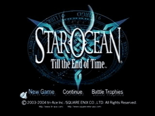
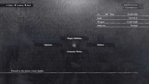
“Immersive, dramatic, grand, mysterious, surreal, and adventurous”
Modernize Existing Brand
Capture the Tone of a JRPG
Reinstate Trust
I opted for a monochromatic color scheme that makes use of different shades of red and black, as well as white. Thus, the existing brand colors are preserved. Additionally, by making use of the color red in particular, I aim to promote the psychological response of passion and excitement, not unlike the feeling of beginning a new game for many.
Colors
Final Designs
#E21412
#E21412
#FF4745
#FF4745
#A50705
#A50705
#141414
#141414
#FFFFFF
#FFFFFF
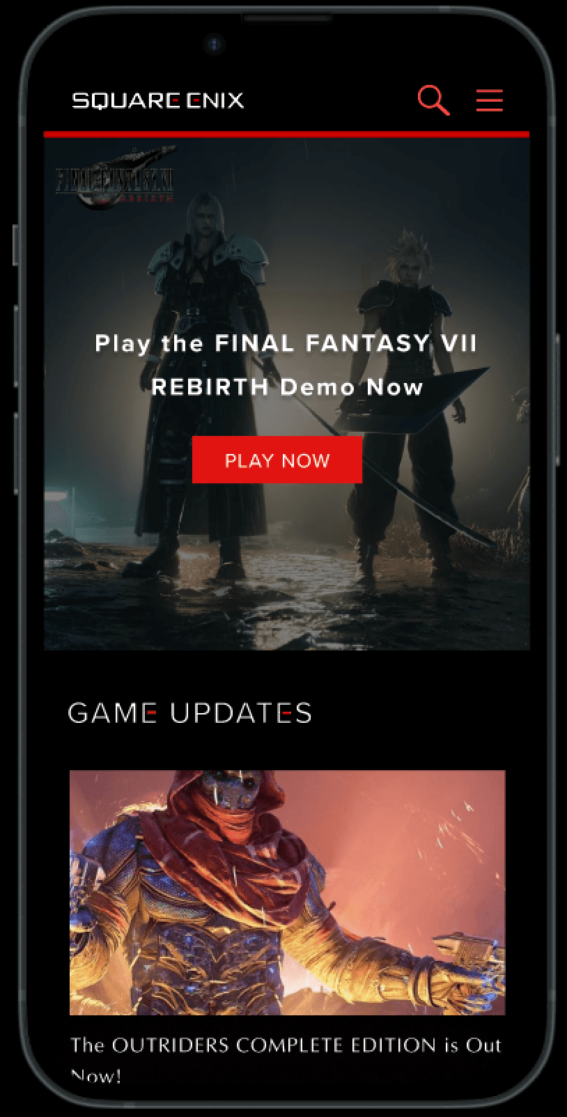
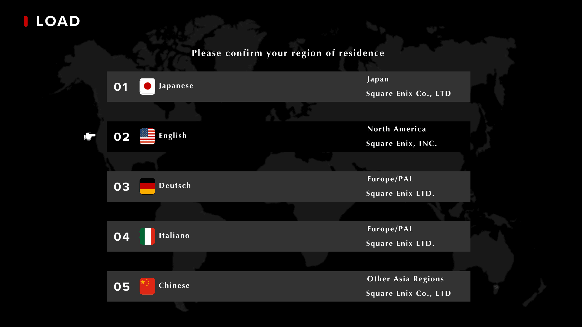
Screen akin to the starting menu of a game. Universal dark mode to further accentuate this theme.
Final Fantasy Cursor upon hovering over save file-themed regions.
Final Fantasy Cursor upon hovering over save file-themed regions.
Gestalt’s principle of Figure Ground to place emphasis on most recent update.
Categorized different kinds of updates for improved organization.

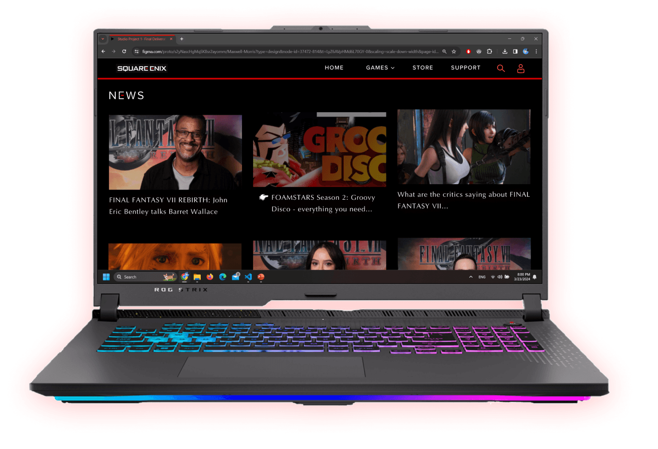
Global Navigation added for consistency, and to connect the store to the remainder of the website
Converted to dark mode and added cursors for purchasable items
Load Save File to Select Region of Choice
Browse for Updates
Visit the Shop
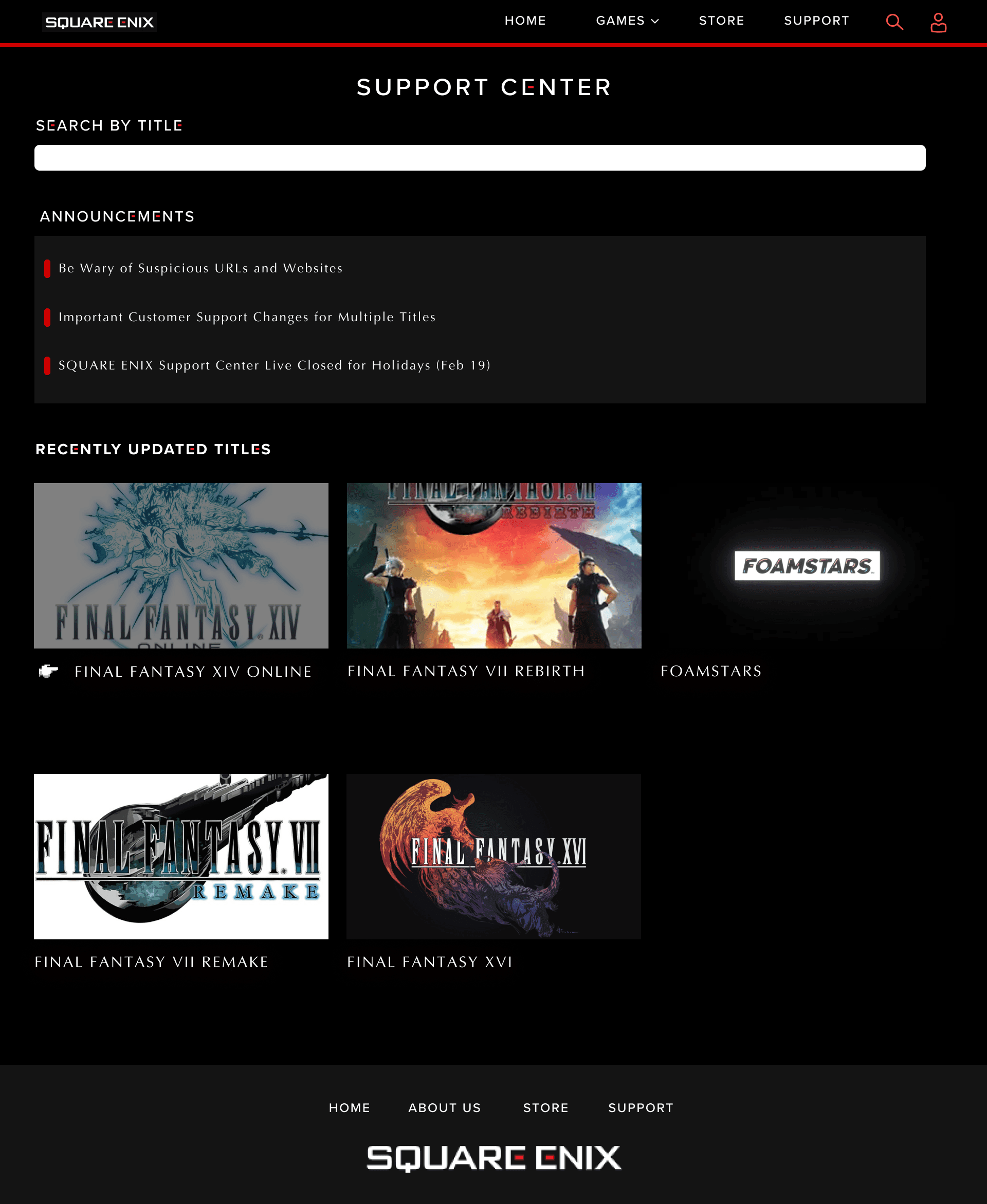
Troubleshoot Issues
Thank you for reading!
Thank you for reading!
Start menu- Buttons break in half on hover. Note the global animated TV static filter
Categorized different kinds of updates for improved organization.
Global Navigation added for consistency, and to connect the store to the remainder of the website
Converted to dark mode and added cursors for purchasable items
Let's Change that.
The existing design lacks organization in its home menu, and the remainder of the pages lack cohesiveness with it. The Support page in particular, where players would go to troubleshoot their games feels quite archaic.
Additionally, most of their published games have very pointy, rigid typographies in their logo which is at odds with their “blocky” iconography. As such, their website gives off a completely different feeling than the games they are known for.
Through the typography, animations, color choices, responsiveness, and overall layout adhering to Gestalt’s laws of grouping, update the website to a more modern-day feel while maintaining the existing titular “square” brand. This includes limited rounded corners and all-caps headers.
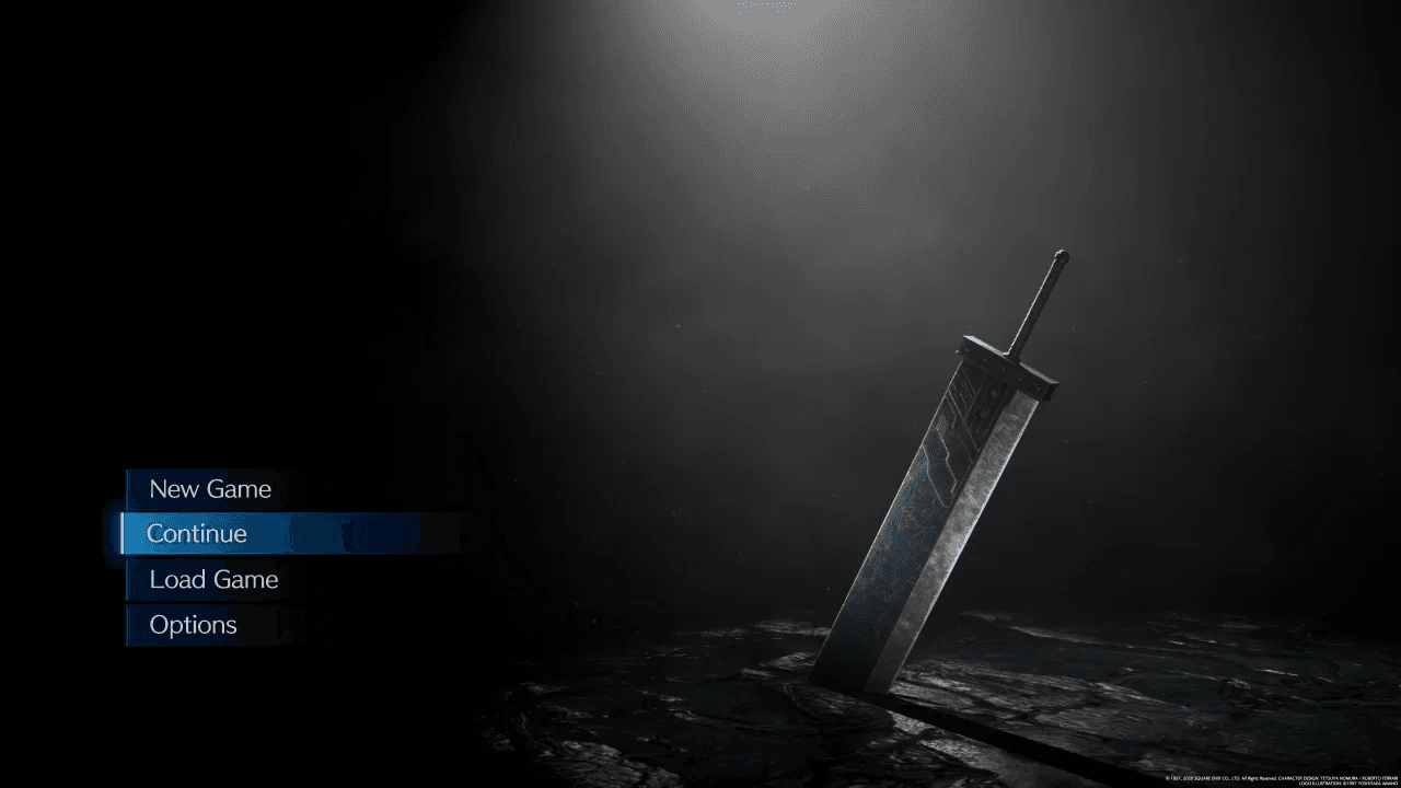
Capture the immersive, dramatic, grand, mysterious, surreal, and adventurous vibes that the JRPG’s from this publisher have to offer. This was done through gamified language, a dark mode that resembles the game menus below, and typography.
The combination of updated visuals, consistent navigation and themes, as well as the gamified design that shows a love for the decades of games Square Enix has produced will help to boost trust among users.

Square Enix is a video game publisher with branches all around the world. It is responsible for publishing popular Japanese role-playing game franchises (dubbed JRPG’s) such as Final Fantasy, Kingdom Hearts, and Dragon Quest.
What is Square Enix?
The Problem
Approach
Through the typography, animations, color choices, responsiveness, and overall layout adhering to Gestalt’s laws of grouping, update the website to a more modern-day feel while maintaining the existing titular “square” brand. This includes limited rounded corners and all-caps headers.
Modernize Existing Brand
Colors
#E21412
#A50705
#FF4745
#141414
#FFFFFF
I opted for a monochromatic color scheme that makes use of different shades of red and black, as well as white. Thus, the existing brand colors are preserved. Additionally, by making use of the color red in particular, I aim to promote the psychological response of passion and excitement, not unlike the feeling of beginning a new game for many.
Final Designs
Screen akin to the starting menu of a game. Universal dark mode to further accentuate this theme.
Final Fantasy Cursor upon hovering over save file-themed regions
Final Fantasy Cursor upon hovering over save file-themed regions.
Final Fantasy Cursor upon hovering over save file-themed regions.
Gestalt’s principle of Figure Ground to place emphasis on most recent update.
Categorized different kinds of updates for improved organization.
Global Navigation added for consistency, and to connect the store to the remainder of the website
Global Navigation added for consistency, and to connect the store to the remainder of the website.
Global Navigation added for consistency, and to connect the store to the remainder of the website.
Converted to dark mode and added cursors for purchasable items
Converted to dark mode and added cursors for purchasable items.
Converted to dark mode and added cursors for purchasable items.
Load Save File to Select Region of Choice
Troubleshoot Issues
Browse for Updates
Visit the Shop
Lack of Cohesion and the Feeling of a Game
Capture the immersive, dramatic, grand, mysterious, surreal, and adventurous vibes that the JRPG’s from this publisher have to offer. This was done through gamified language, a dark mode that resembles the game menus below, and typography.
Capture the Tone of a JRPG
The combination of updated visuals, consistent navigation and themes, as well as the gamified design that shows a love for the decades of games Square Enix has produced will help to boost trust among users.
Reinstate Trust
Let's Change That.
The existing design lacks organization in its home menu, and the remainder of the pages lack cohesiveness with it. The Support page in particular, where players would go to troubleshoot their games feels quite archaic.
Additionally, most of their published games have very pointy, rigid typographies in their logo which is at odds with their “blocky” iconography. As such, their website gives off a completely different feeling than the games they are known for.
“Immersive, dramatic, grand, mysterious, surreal, and adventurous”
Thank you for reading!